

Showing posts with label write-up. Show all posts
Showing posts with label write-up. Show all posts
Tuesday, July 5, 2011
Cy Twombly Dead At 83
Cy Twombly died in Rome Tuesday, having long struggled with cancer. He was a tremendously interesting and hardworking Painter with a capital "P" from an era when that really meant something. There's a brief New York Times piece here, and a fairly comprehensive gallery/biographical site here.


Monday, June 27, 2011
Impressions On My Lenovo Thinkpad X200 Tablet Running Ubuntu 11.04 (Natty)

Alright, first --albeit not comprehensive-- thoughts on my new laptop and its handling of Ubuntu 11.04. On my previous computer, which was simply too old and slow to even bother listing the specs here (suffice to say that the chipset it was running also helped launch the Apollo missions) I never bothered to upgrade from 10.10, so both the machine and the Unity experience are new to me.
The Specs (Important ones anyway)
- 1.86-GHz Intel Core 2 Duo L9400
- 2 Gig of RAM, upgradable to 8 Gig
- 160 Gig, 7200 rpm SATA HDD
- 12.1 1280x800 display
- 802.11 a/b/g/n Wi-Fi
- 3.5-4.2 lbs (depending on battery)
- ports: 3 USB, Ethernet port, VGA out, ExpressCard slot, audio out, mic in, modem jack
The Computer
It's heavier than I expected. There, I said it. While it's light enough, and the size is perfect for me ( I can't imagine ever going bigger than this in the future), it's both fairly hefty and thick enough to be awkward handling sometimes. Mostly this is when in tablet mode, which definitely presents a couple of grip difficulties. I'd heard rumblings of this around when I was researching the tablets on the market. I'd heard all the stories, but I thought 'Fuck it, I'm Sam Rothstein, I can change her'. This was a mistake. The extended battery (8 cell on my model) is supposed to serve as a handle but it just doesn't feel secure, and I worry a bit to much to chance using it that way. It's possible this'll change, and apparently the newer models (x201t, x220t) have a more solid feeling here, so that's a step in the right direction.
Noise-wise, not applicable. There is a definite whirr, which if you're totally alone in silent room is noticeable, but almost any amount of incidental noise masks it nicely. the speakers themselves are, well, acceptable. This is being sold as a light business laptop, not a multimedia machine, and that the speakers are-- (a) Located on the bottom of the computer and (b) a little tinny-- isn't surprising.
The heat. Keyboard-wise, not bad at all, most noticeably warm on the palm rest areas, but nothing out of the heat range you'd expect from a comparatively recent laptop. Where there does seem to be spikes are outside the exhaust port when the computer is in tablet mode, which I assume is a result of the slightly more intensive imaging programs I'm usually using when in tablet, and the bottom corners of the screen. The first of these wouldn't be an issue really, were it not for the fact that a large part of the fun of tablet mode is to rotate the computer in different directions, and while doing this you risk ending up taking the risk of uncomfortable blasts of hot air to the crotch. The second problem is more glaring, as your hand will be doing a fair amount of resting in the effected area while in tablet mode, and it gets very uncomfortably hot after a few minutes. It's big enough to be more than an irritant, but not the hugest of problems either-- and again-- the newer models are said to run cooler than this.
Other thoughts on the build... There's a lot that's been written on the keyboard quality of IBM/Lenovos, some of it hyperbolic sounding, and yet... words cannot describe... It's.....beautiful.... They should have sent a poet... It is excellent, probably the best keyboard I've ever used, never mind just in terms of laptops, full-size, just enough push back, the edges of all the keys are nicely beveled, which maximizes the distance between them. The browser page backward and forward buttons (which sit just above the left and right arrow buttons, respectively) were a little grating at first, if you don't know they're there it leads to some initial irritation, but you settle in fairly quickly.
The much disparaged IBM/Lenovo "nipple" trackpoint (this machine doesn't have a trackpad) is another one that'll hold you back the first day or so, but I'm quite taken with it at this point, it integrates browsing and typing in a way that trackpads/mice can't really hope to manage. Add to that the scroller between the left and right buttons and you have a very effective non-screen based navigation, albeit one that takes some getting used to. My one complaint here is that there does seem to be an occasional drift/stickiness to the trackpoint, once in a while I'll be leaving it alone and the mouse begins to crawl almost imperceptibly across the screen. I haven't ruled out communication from the spirits of the unquiet dead yet, but it seems unlikely, as I think is the possibility of this being a Unity driver error of some kind. This might be one to chalk up to refurbished problems or the original build.
Well, here we go then, the big one: the screen. It is, for the most part, excellent. I got a fairly bare-bones model, without the touch/multitouch feature, which feels unnecessary for arts/design purposes, and adds not inconsiderable weight/depth to the machine. It is also not the outdoors friendly no-glare/reduced-glare screen, and while both the colors and viewing angles indoors are certainly exceptional it doesn't hold up too well in direct (or sometimes even indirect, really) sunlight (again, not the model that's designed to, so not super surprising). In terms of the pen receptiveness, mine worked fine right out of the box, one calibration later on didn't seem to make a difference, the stylus and the pointer are pretty perfectly in sync, although viewed from head-on there's a bit of a gap between the two when working at the sides of the screen. I can be a bit irritating doing freehand drawing, the pen tip doesn't protrude too far from the barrel of the pen, which causes it and the cursor to be blocked by the bulk of the pen. Although not strictly a screen issue, after a long enough drawing session the screen misses every alternate stroke, I think this is a result of needing more RAM, I'm looking forward to complying.
So there's the breakdown of the machine itself. Next week comes a not-especially thinking man's thoughts on Unity, and after that comes the reason I bought this sweet baby in the first place: what it's like to draw on. So stay tuned my two friends who subscribe to this thing.
Wednesday, November 3, 2010
Golub from the Block

It's strange, but artists seem to take one of two tacks when closing out their working lives. Some take solace in the spiritual, in religiosity or tribal or ethnic histories, their place in their intellectual lineage. A good example is William Blake, great anarchist poet and free thinker, who spent his final years in a sort of religious ecstasy, producing illustrations of biblical stories and Dante's inferno.
And then then there are artists who spend the last decade or so wallowing in decay and exploring their own frailty. It would be a mistake to attribute work like this to depression, it's simply a continuation of the focus and concentration with which they questioned all aspects of life beforehand. This is the fun category probably for the same reason that everyone reads the first third of The Divine Comedy and never the rest of it: suffering and unpleasantness is relate-able and universal. All happy families resemble each other-- and all that.
Artists who spend their careers casting light into unpleasant topics should owe no less to the end of their own lives. It's with this attitude that it's best to walk into the Leon Golub exhibit Leon Golub, Live & Die Like a Lion? currently at Northwestern's Block Museum, as it illuminates both the strengths and weaknesses of the work.
Gone are the large scale oil on linen canvases. The show contains one tremendously unfinished outline of a large scale work, and a few mid sized printing experiments, mostly from much earlier in Golub's career. There are themes and characters in the drawings drawn from the rest of his work, but most of the similarity ends there. The show is nearly exclusively drawings from the last five years of Golub's life, a period of prolific (if scaled) production. Most of the drawings measure about 8 by 10 inches on vellum, usually executed with oilstick and ink, with a gesture and application more spontaneous than the slow, intentional painting and scraping of his canvas works.

Also differentiating them from his other work is how solitary they are. Most of the large scale works Golub is known for are narratives of at least two characters, often a victim and (at least one) aggressor. Golub seems to have retreated from his mid career viciousness, searching for humor and ugliness in individuals, animals, and intimate acts, rather than in politically or socially motivated violence (his usual oeuvre). Satyrs fucking (it really can't be called making love) replace South American goon squads, nudes and portraits of snarling dogs take the place of apartheid regimes. It's surprising how much humor is present: goofs on Matisse and Ingres, lions, dogs, and skeletons rendered with as much (and often more) affection than his people, scrawled grafitti. Probably the best pieces in the show are the ones of couples screwing, which can't seem to make up their mind between being funny or kind of horrible, and in-between is exactly what they should be.

There are problems with the show too, some of it size. In the time period the show covers Golub produced some 400 drawings, the Block displays 42. Also (and more importantly) Golub's artistic life was a series of reactions to social events and causes, but this work feels bound inside the artist's head, and though clever and fun, subsequently feels divorced from the world he spent most of his career focused on. Without the social and moral conflicts of his large-scale paintings the work feels...well, small. The closest the show comes to real violence is still miles apart from the feeling of his earlier work. The dichotomy between spiritual and physical here certainly leans to the physical, but not with any oomph. Golub doesn't declare his belief in the beyond or the powers of harmony, far from it, but there's nothing in the show that attacks the possibility, like you see at the end of Picasso's life. There's a certain pull to the punches here that you don't see in Golub's earlier career. If at the end of his life Morandi had switched to portraiture, the result might be equally revealing, and equally frustrating.
The show is -at the very least- perfectly interesting, as are most Block Museum ventures, but it's certainly not an introduction to his work for the uninitiated. If you have familiarity with his work, or can rope someone who does into giving you a tour in the month or so the show has left, it's a must-see. Golub is an unapreciated artist, but his work is certainly going to speak to us for some time to come.
Leon Golub, Live & Die Like a Lion? runs until December 12th. You can visit the Block Museum's site here.

Wednesday, October 6, 2010
Luc Tuymans's: A Funny Sound To Make
 The MCA currently showing a body of Luc Tuyman's work entitled: Luc Tuymans. So, uh, pretty basic title there.
You can read Ben Stoler's excellent Chicagoist review here, but first you should read this, because Chicagoist already has plenty of readers.
The first thing is that this show is striking. Just... wow. I would hesitate to say that a lot of exhibitions I've seen at MCA are... less than stellar in their focus, but... well, there it is. This, however, is smashingly assembled, quietly powerful with almost no fat or filler (incidentally, the show was co-organized by the San Fransisco Museum for Modern Art and the Wexner Center for the Arts). It's amazing how commanding the work is, considering how muted. My first reaction was that I was reading Moby Dick in size 2 type. If you've ever wondered what the missing link is between the dynamism of Gerhard Richter and the blank-faced bankruptness of Alex Katz and Elizabeth Peyton, here you are.
The show is a perfect, compact introduction to both his body of work and his method. After gallery after gallery of subtle, riveting work we're granted a look into his material inspirations: photographs, magazines, film and film stills, postcards, recognizable personalities and iconography. Too often ephemera like this feels like a put-on, an invitation to get a little closer to the "cool artist" persona; "Oh neat, polaroids of beautiful people in studios". Here it offers an amazing insight into the exact way Tuymans absorbs media. There's little collage, little corection or sketches, just images you can see distorted in his corpus. The recontextualizing he does in the previous rooms is mapped here out for the viewer, and the work we've just studied comes to life again behind us, creeping with renewed menace.

It would be wrong of course to discuss the show without making a note of the actual paint. It's infrequent that the MCA has work as "traditional" as this, gallery after gallery of oil on canvas, actually though the painting itself is a pretty radical departure from oil tradition. Thin, matte, and dry, with little reworking or correction, the paint here is about as far from the effects oil conventionally strives for as one can imagine. A debt to Richter (and, I think, to Balthus) aside, it's difficult to think of a precursor to the style and confidence of these paintings. The virtuosity of the painting is only excelled by how bare bones it is.
One of the most interesting pieces featured is, suprisingly, a short loop of film by Tuymans, mostly just half hidden faces, which reveals how specific and all encompassing his vision is. That he's managed to transform film into the tonal aesthetic of his paintings is a small miracle, it looks like a silver nitrate print or photoetching in motion, and illustrates how practiced is the ambiguity of the rest of his work.
Of course, inseparable from his working method is the content of his paintings. Holocaust imagery, toppled African states, privilege, scattered religious imagery, these could be the concerns of any European artist coming to grips with any European country's role in the 20th century. But in Tuyman's hands there's little judgement, little condemnation, simply bloodless reflection. I don't mean this disparagingly, he doesn't condone the colonialism, racism, and violence he's reflecting on, simply that the tone of the work is so sparing as to almost leave judgement up to the viewer. A crop here, a face in shadow there, his denunciations are, like the paintings themselves, faint but effective. Among the most shocking is a small painting of Himmler, a dark silhouette against a wall and without a face. Here Tuymans needs to do no more than set the possibility of a mood; the viewer's knowledge of one of the last century's great monsters provides the unease.
 |  |
The exhibition runs through January 9th of next year.
MCA's exhibition page here.
Tuymans has a weird site, better off using Saatchi's page/bio if you're interested.
Tuesday, September 28, 2010
Jack Levine

Certain artists will never have a widespread public appeal. Their work is too specific, focused, obscure, referential, or just too fucking ugly to ever expose them to a wider audience. Damien Hirst and Jeff Koons produce objects and art that speak to us about celebrity, excess, exposure, and wealth, and are famous, excessively exposed, and impossibly wealthy for it. They go beyond the manufacture of art about pop culture, they live it. Even Koons's interview persona, all creepy and dead-eyed is, I maintain, an intentional homage to Paris Hilton.
There are some artists though who simply due to management, or luck, or the nature of their work can never expect their reputations known outside of art circles. Lawrence Weiner will never be Bruce Nauman (mostly because of the name), Stanley Spencer will never be Lucien Freud, etc. Jack Levine is one of these artists. He is, at 95 years old, destined to be remembered as a painter's painter.
One of the mid-century American Social Realists, Levine has spent a career lampooning power and money (the people who have them, not, like...the concepts) in pretty brutal terms. The strange thing about his obscurity, versus someone like Koons, is that Levine's message seems so appropriate to today's audience. Koons creates work that we interact with the same way we interact with MTV Cribs or the Jersey Shore; it's designed to be envied, derided, laughed at, to offend or excite, but to do it out of reach. This is work made by, purchased, and displayed by the implausibly wealthy, as we sit on couches and critique, imagining we have a role in the process. Levine, meanwhile, deals in an explicitly middle class outlook, less glitzy, more clever, angry, and translatable than a lot of the gentle intellectual abstraction you can see today.
 Jack Levine was born January 3rd 1915 in Boston, to a tight-knit lower middle class Jewish family in the South End. From a young age he displayed an affinity for drawing and, at fifteen, he and Hyman Bloom began an apprenticeship of sorts with Harold K. Zimmerman, who was then teaching at the West End Settlement House. In the early 1930's the two fell under the sway of Denman Ross, who was then the force behind Harvard University's art department. Both later credited Zimmerman's instruction in drawing and Ross's very particular color theories (full Google book here), although Levine said neither ever adopted them fully.
 |  |
A stipend from Ross had allowed Levine to concentrate on his studies. After Ross suspended it Levine found himself without a job or income at the height of the Great Depression. After working for the Works Progress Association on and off for four years he was found ineligible for further work there and enlisted in the army in 1942. His poor childhood, years of unemployment and underemployment, and his time in the stifling atmosphere of the army all marked in him a dislike of economic and authoritarian hypocrisy. After his discharge in 1945 he embarked on four decades of artistic production and biting social commentary.
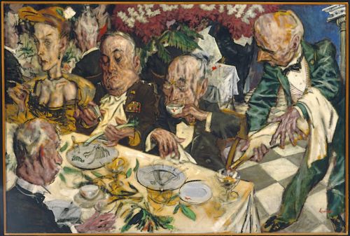
Welcome Home (above), which he painted after leaving the army, caused a furor when it was shipped to Moscow a few years later as part of a traveling exhibition.
Eisenhower, when asked by a reporter about it answered "[It] looks like a lampoon more than art, as far as I’m concerned."
Seen in the context of the artists/editorialists who proceeded him it becomes clear that Levine's hand is tied to his content. There's certainly a shared aesthetic to the body of work on the line between Social Realism and Expressionism. You see a shared subjective eye in Goya, Daumier, Lautrec, Philip Evergood, George Bellows, Leon Golub, Nancy Spero, Ben Shahn, Ivan Albright, and others. The energies that other movements have invested in harmony, balance, or color these artists have turned towards describing dissonance, violence, hate, and fear. Using a visual medium -rather than a spoken or written one- to describe something or someone you hate is a visceral experience, and these artists have taken full advantage of it. Levine's paintings sometimes seem as if even the paint abhors describing its subjects. Strangely, he rejected the Wiemar Expressionism which his work is often compared with. For him the distortions were too much; he felt the Germans sacrificed a level of objectivity he seemed to regard his own work with.
 |  |
 |  |

In all Levine is one of the talented American draftsmen of the last century. The movement towards abstraction paused just long enough (after the start of the Great Depression and up until the early 1950's) to allow him and other socially conscious painters like him to flourish. However, the rapid change in American art during the later half of the twentieth century was not amenable to figuration, and not to Levine. Like many other artists and many traditional techniques he was lost in the shuffle.
However, with the (comparative) re acceptance of figuration, the greatest economic recession in a century and the wealth disparity in the country growing further and further it seems to me that Levine is due for a comeback. Looking at his work now it occurs to me how little has changed in terms of wealth distribution in the country since it was painted. I'm no fan of populism (mostly because it's so often misdirected, I mean, come on guys, Jews are not at fault for this stuff) but these days anger at the richest 1% of Americans strikes me as healthy. Levine's work (at least one example) can be found in museums in most American cities, and because so many of us are unemployed now there's plenty of time to look at them. We don't have a new WPA yet, but it's never too early to start get organized and get outraged.

all images are Levine's unless otherwise noted
Friday, August 27, 2010
Playtime at Rotofugi

Whew. Tonight I was at a party for the opening not only of Chicago gallery/toy store/awesomeness repository Rotofugi's new location, but also the current show there: Playboy Redux. The show, which is in honor of Playboy's 50th anniversary, was orchestrated by Playboy Enterprises and the Warhol Museum, where it showed before coming to Chicago.
From Rotofugi's site:
Known at that time for her satin bunny suit, cotton tail and rabbit ears, the Playboy Bunny served cocktails and glamour in equal doses. Many luminaries once worked as Bunnies, including Deborah Harry, Gloria Steinem and Lauren Hutton. For Playboy Redux: Contemporary Artists Interpret the Iconic Playboy Bunny, artists were asked to create a new look for the Bunny, a veritable makeover to create the Bunny of the future.
So, first things first. Rotofugi's new location is amazing. It looks like social deviant art monkeys took over a nice Apple store and had their way with it. The size alone, compared to the cramped one-bedroom apartment style store they previously occupied on Chicago and Damen, blows you away. Add to that the fact that their gallery space is now integrated into the store environment and it makes for a perfect statement on the fusion of old-fashioned fine art, like painting and photography, and um...new fashioned fine art, like graphic work, illustration, and DIY designable maquettes.
Now then, the show. It's pretty apparent that Playboy Enterprises had a hand in it, as this is not a collection of work you'd expect to see in an independent exhibition. The art doesn't really ask anything about the mid-century Playboy mentality, it's just fond reminiscing in the service of the Playboy look. This is the problem with a corporation/brand having a say in the curation of an art show about that brand's iconography and legacy, especially if those happen to be a controversial as Playboy's. I don't mean that the Playboy of today is controversial, it isn't. But the Playboy of the Playboy Clubs era--the period that inspired the show--that inheritance is probably still fair game for debate.
The press release quoted above notes that the list of bunny graduates include Gloria Steinem, which seems like somebody's little in-joke more than anything else. Steinem worked as a bunny in the New York club in 1963 as research for her article "I was a Playboy Bunny"... you can guess what she had to say about the experience. The Playboy Clubs were at best harmless and offensive, and more often misogynistic, patriarchal, and declassé. Obviously it's easy to forget about this, the casual disregard for women the clubs evidenced has been hopefully drowned by progress and is hard to recall, and artistically the colorful, retro, swingin' vibe that we associate with the time period helps to assuage what it's values really were. That's the real issue i take with the show's content, it's harmless fun jaunty work (most of it anyway), more pastiche of the period's aesthetics than content or commentary. It's a show that watches Mad Men and then says to you, "Wow, everybody back then really knew how to dress!"
There are exceptions. Some of the artists have taken the Playboy label and twisted it in unexpected ways, some of which reflect on Playboy and some on their own work. Rod Filbrandt's small goauche and ink drawing is so mindlessly energetic and positive that I can't help but think he's in on the joke. Isabel Samaras and Ain Cocke also deliver great pieces, neither of which ape the mid century Jetsons look, opting for the sort of paintings you could imagine Playboy purchasing for the offices, self aware cheesecake that looks more period but is also more self aware than most of the other works. Cocke's especially is an awesome gag that's made better by thinking only you and the painting are in on it. Brendan Fernandes's piece "Bunny Dearest" is probably the loneliest art in the exhibition. While everyone else indulges in pastel color and swirling pattern Fernandes's piece is all stark sparse black lines that are an incredibly refreshing break.
Tim Biskup has what is easily the most confrontational work in the show. While everyone else has chosen coquettish/sexy or graphic/grotesque, Biskup's is the only bunny that looks contemporary, self assured, and straight up pissed. This painting would be fine with leaving the club, locking the doors from the outside, and burning it down. Also, nestled in the back corner of the gallery is a Travis Lampe painting "Bump Mate" that quite simply represents what I think this show could have and should have been: titillating fun, and also gross and unsexy.
 |  |
Lampe (left) and Biskup's (right) work
All in all it's worth seeing, if only for those few works and to remind yourself that art has a purpose. Allowing an opportunity to examine the meaning of a symbol like the Playboy Bunny to escape unscathed is a tremendous failing, and the show lacks a depth because of it. Still, Hef will have to kick it one of these days, smothered under a blanket of nubile (but disgusted) young flesh, and think of the show we'll have to look forward to then.
You can see all the work in the show here, but just nut up and see it in person.
The show runs through September 12th. Rotofugi is located at 2780 N Lincoln Avenue.
Thursday, August 26, 2010
West Prize 2011 is underway


Above is 2010 West Prize winner Ryan Mclennan's piece 'Departure'
Wowzers.
The West Collection is an art collection privately owned and administrated by Alfred P. West and his daughter Paige West. Recently in an effort to expand museum holdings/garner new talent/subsidize poor-creative-types the collection is holding an open call for new artists. The competition will award 10 artists (in acquisition funds for work) $10,000 each, with one grant winner also receiving $25,000 for a proposal probably presented via one kick-ass powerpoint presentation. This competition is, at two years running, incredibly new.
Actually in a way it is and it isn't.
Right off the bat, rich people collecting art isn't exactly new. Thank god it isn't, the wealthy have been and continue to be awesome lifelines for a lot of great artists who would otherwise be selling their bodies to get money to buy pencils (crack pencils). However, in an art environment with less and less significance attributed to "critical authority" it's the market that determines artistic merit. Meaning rich curators have the hugest say right now in determining what is "good art" and subsequently what art gets funded/seen. That means if moneyed collectors don't know what they're doing they can consecrate crap, shit-up the careers of promising artists, and destabilize market value. That's how it's not new.
Alfred (Al) West, founder and CEO of SEI Investment Co. is a self made billionaire. Billionaire. Daughter Paige is a full time art curator and author, with both studio and arts administration training, and apparently really is the force behind the collection. Meaning no disinterested-commodities-broker-hiring-art-buyers-to-diversify-their-investment-holdings-with-art type situation. Also, they stock their investment company's offices with artwork, and force the employees to deal with it/suck it. These are exactly the kind of rich, informed, engaged fucking lunatics you want at the helm of something like this. That's how it is new.
I'm not particularly nuts for all of the work that the Wests seem to be focused on, a lot of the 2-D work especially, which seems to be acutely aware of the amount of Whimsy and Idiosyncrasy that Contemporary Art has to have. This may just be a feature of the current self-fulfilling market for those sort of pieces. The sculpture, video, photography, and installation seem more on-point. The Art Blog has a great write-up of last years competition, they are as usual, spot on.
That having been said there's also clearly a point of view to the collection, they obviously know what they want. There's a lot of emphasis on the environment, of consumption (conspicuous and otherwise), on nature vs. city living, etc. Having perused the current entries I encourage all artists and artistically minded crazy people to apply. The rolls close Novermber 1st, 2010, and finalists are announced January 1st, 2011.
Enter the competition here
So tailor your work and get to it! Crazy prize money and glory await!
Subscribe to:
Posts (Atom)